Published on Medium Article
I don’t about you, but the first time I saw data in a histogram it looked like a “Pyramid of Lego Blocks” to me.
I have since realized that histograms can reveal many more secrets that can be very useful for an aspiring data scientist.
Wikipedia Definition: A histogram is an accurate representation of the distribution of numerical data.
For a data scientist this understanding about data distribution and shape of data is fundamental to the analysis we are asked to perform.
What Should I Look for in a Histogram?
As you examine a histogram, ask yourself these questions:
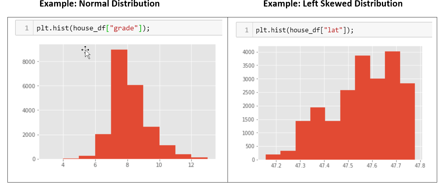
Q: What is the shape, center and spread of a histogram?
The center is the median and/or mean of the data. The spread is the range of the data. And, the shape describes the type of graph. The four ways to describe shape are whether it is symmetric, how many peaks it has, if it is skewed to the left or right, and whether it is uniform.
Q: What’s the overall shape?
For overall shape, notice whether the histogram is symmetric or skewed. A histogram that displays a symmetric distribution has a single peak and the left and right sides are roughly the same, with no gaps or apparent outliers.
If the histogram is heavier on one side than the other side, you have a skewed distribution. As you move away from the peak, the thinner ends of a distribution are called “tails”.
Q: Does the histogram have a single, central peak or more than one peak?
A multimodal distribution has more than one peak. Histograms are the best method for detecting multimodal distributions.
Q: Are there gaps or outliers?
In a histogram, outliers appear as an isolated bar; disconnected from the continuous data.
Q: What is the count or frequency of data values for a column?
• Data value range is indicated on the x-axis. • Data value frequency is indicated on the y-axis.
In conclusion …
Exploring Your Data with Histograms reveals informative insights about your data, which is important to aspiring data scientist.
Authored by: Sharonda Warner